Tag: interior design

  • Kill the Big Light: A Better Way to Illuminate a Room

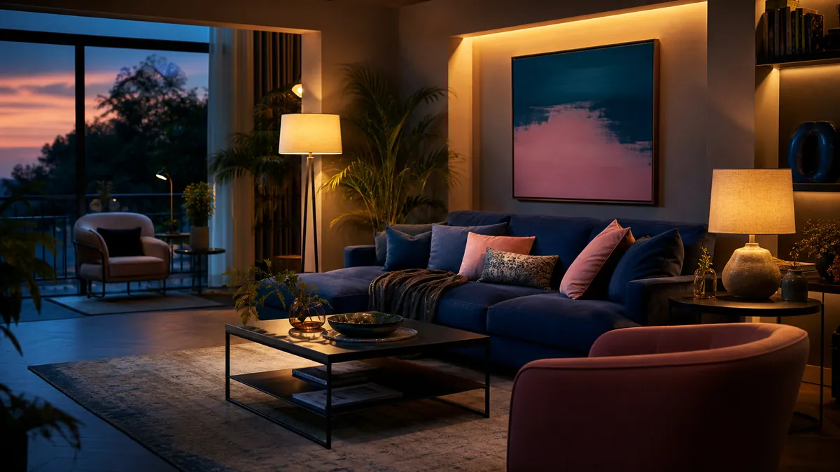
    A living room illuminated by layered floor, table and indirect lamps

    The ceiling light is efficient in the same way a supermarket is efficient: everything is visible, but almost nothing looks flattering. Homes need more than maximum illumination. They need pockets of light that support reading, cooking, conversation and the highly technical activity of doing absolutely nothing.

    Think in layers

    Ambient light establishes the room’s general brightness. Task light helps with a specific activity. Accent light gives depth to walls, objects and corners. A comfortable room usually combines all three at lower intensity instead of asking one fixture to perform every job.

    Light the edges

    Dark corners make a room feel smaller, while gently illuminated walls create depth. A floor lamp aimed toward a wall, a small lamp on a low cabinet or a shaded light near a corner can change the perceived size of the room without increasing overall brightness dramatically.

    Put light where life happens

    A reading chair needs a controllable lamp near shoulder height. A dining table benefits from a focused pendant that leaves the surrounding room softer. Kitchen worktops need direct, shadow-free light. Start with activities and positions before choosing fixtures.

    Control glare

    An exposed bright bulb at eye level is tiring even when the room looks atmospheric in photographs. Shades, diffusers and reflected light soften contrast. Sit in the places you actually use and check whether the source is visible. Good lighting should reveal the room, not interrogate its occupants.

    Choose warmth intentionally

    Warm light generally suits living areas, while neutral light can help in workspaces. Consistency within a sightline matters: wildly different color temperatures make adjoining areas feel accidental. Dimming is often more valuable than chasing a single perfect specification.

    Keep the big light for finding a lost earring. For living, build a small constellation instead.
  • Why Colorful Furniture Makes Minimalist Rooms Better

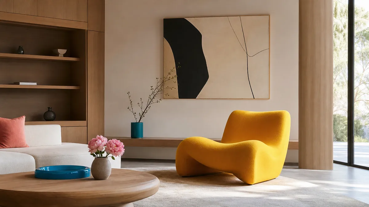
    A sculptural yellow chair in a warm minimalist living room

    Minimalism is often mistaken for a restricted palette of white, grey and apologetic beige. But the real strength of a minimal room is editing: fewer objects, clearer relationships and enough space for each choice to matter. That makes color more powerful, not less.

    Color creates hierarchy

    In a quiet room, one saturated chair or cabinet immediately establishes a focal point. The eye understands where to land, and the surrounding furniture can become simpler. Without that anchor, a restrained interior sometimes compensates with too many small decorative objects.

    Choose a useful protagonist

    The colorful object should earn its floor space. A chair, lamp, rug or storage unit works better than an ornament because it combines visual impact with daily use. The goal is not to place a random bright object in the corner. It is to choose something whose form deserves attention.

    Repeat, but barely

    A dominant color feels more intentional when it appears once or twice elsewhere at a much smaller scale: a book spine, a line in an artwork or a ceramic detail. Exact matching is unnecessary. Related tones create rhythm without turning the room into a themed display.

    Let materials calm it down

    Wood, brushed metal, wool and natural stone give saturated colors something grounded to push against. Texture also keeps neutral areas from feeling empty. A bright lacquered cabinet beside warm timber feels richer than the same cabinet surrounded entirely by glossy white surfaces.

    Live with samples

    Color changes dramatically across daylight, evening lamps and screen photographs. Test a large sample in the actual room and observe it for several days. The exciting yellow in a showroom may become acidic under a cool lamp; a deep burgundy may become the warmest element in the house.

    A minimal interior does not need less personality. It needs fewer, stronger decisions. Sometimes one gloriously colorful piece is the most minimal choice available.

  • Burgundy, Yellow and Black: An Eames Lounge Chair in Good Company

    Burgundy, Yellow and Black: An Eames Lounge Chair in Good Company

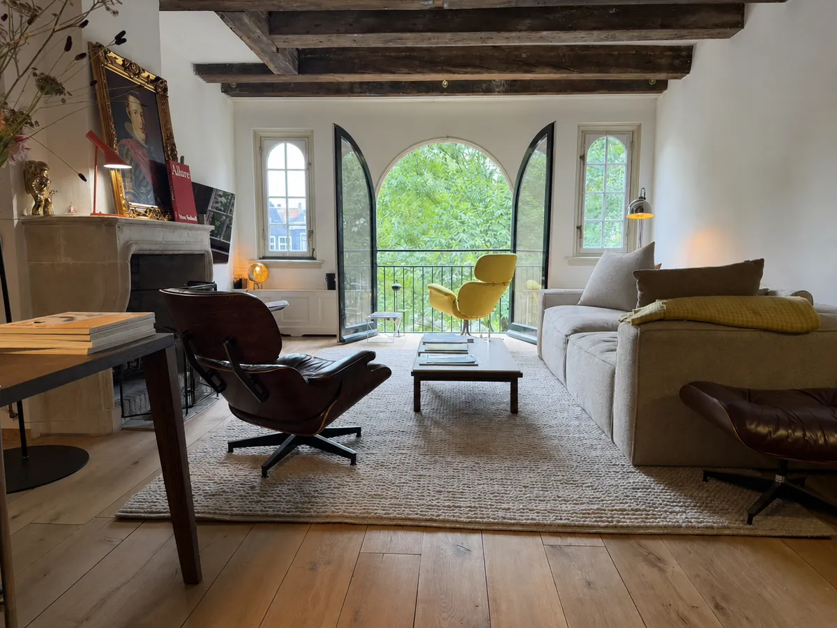
    A burgundy Eames Lounge Chair does not disappear into a room—and it should not. The deep leather, curved wooden shells and black aluminium base create a silhouette that is generous without becoming bulky. It is an icon, certainly, but the real pleasure begins when it stops behaving like museum furniture and becomes part of everyday life.

    Burgundy Eames Lounge Chair in an Amsterdam living room with a yellow Grand Repos
    Burgundy leather, dark shells and a room that happily mixes design generations. Editorial image based on the actual interior.

    The chair that changed the idea of modern comfort

    Charles and Ray Eames introduced the Lounge Chair and Ottoman in 1956. Instead of the visual austerity associated with much early modern furniture, it offered softness, warmth and the relaxed character of a well-used club chair—reinterpreted through moulded plywood and industrial production.

    Vitra has produced the chair in Europe since the 1950s using methods that remain close to the original. The relationship between the three curved shells and loose cushions is the essential idea: structure and softness remain visibly separate, which keeps the chair from looking heavy.

    Why burgundy is better than safe black

    Black leather is canonical. Burgundy is personal. It brings out the reddish warmth in the wood veneer and changes throughout the day, moving from near-brown in shadow to wine-red in direct light. Marks and creases become part of that colour rather than flaws to be corrected.

    The chair works especially well among old beams, stone, books and imperfect materials. Its precision gives the room structure; the leather prevents that precision from feeling cold.

    The best original design is not protected from life. It becomes better evidence of it.

    Across the room: Grand Repos in yellow

    The yellow chair in the background is not another Eames. It is Vitra’s Grand Repos, designed by Antonio Citterio in 2011. Its concealed synchronised mechanism allows the backrest to recline and lock at different angles. Where the Eames Lounge Chair makes its construction visible, Grand Repos hides the engineering inside generous upholstery.

    The combination is more interesting than a matching pair. Burgundy and yellow create tension; American mid-century optimism meets contemporary Italian precision; one chair cradles through fixed geometry while the other moves with the sitter.

    The quieter counterpoint: Cees Braakman’s SM07

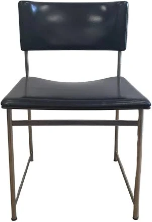
    Elsewhere in the interior, the black dining chairs appear to be the SM07 designed by Dutch modernist Cees Braakman for UMS Pastoe’s Japanese Series around the turn of the 1960s. Their slender chromed-steel frames and black upholstery use almost nothing to describe a chair.

    Black Pastoe SM07 dining chair attributed to Cees Braakman
    The likely Pastoe SM07: visually light, geometrically direct and unmistakably Dutch. Reference image; labels and construction should be checked for definitive authentication.

    Braakman’s restraint is the necessary counterweight to the lounge chairs. The SM07 does not compete for attention. Its thin rectangular frame allows architecture and people to remain visible through it. That visual economy is why a sixty-year-old dining chair can still feel current.

    An interior built through contrast

    Good rooms rarely come from buying a complete collection at once. They grow through differences: sculptural lighting against old stone, a technically complex recliner beside a 1950s icon, and minimal Dutch dining chairs holding the composition together.

    The Eames remains the emotional centre—not because it is famous, but because burgundy leather gives a highly recognisable object a specific life and place.

    Further reading: Vitra Lounge Chair and Vitra Grand Repos.