Category: Uncategorized

  • Take the Slower Road: Designing a Better European Road Trip

    A small car following a winding coastal road in northern Spain

    A road trip promises freedom, then quietly becomes a spreadsheet of hotels, parking rules and arrival times. The cure is not more optimization. It is less distance. A better route creates room for the unplanned lunch, the coastal road that takes twice as long and the town that deserves another night.

    Count transitions, not kilometres

    Every move includes packing, checking out, navigation, parking and learning a new room. A short drive can still consume half a day. Fewer bases often produce more actual experience, especially when each one supports day trips in several directions.

    Keep driving days human

    Three scenic hours can be delightful. Seven motorway hours are transportation wearing a holiday costume. Alternate travel days with stationary days, and avoid scheduling the most demanding drive immediately after a late arrival.

    Choose one deliberate detour

    Leave space for a road selected because it follows the coast, crosses a mountain pass or reaches a small restaurant. Not every segment needs to be scenic. One memorable detour is better than forcing the entire route through exhausting back roads.

    Research the boring details

    Parking zones, toll systems, low-emission restrictions and market days shape a trip more than inspirational photographs do. Check official local information before arrival and save essential instructions offline. A beautiful old centre is more enjoyable when the car is legally parked outside it.

    End days before exhaustion

    Arriving with daylight leaves time to solve parking, check in and walk around before dinner. It also creates a margin for weather, traffic and the irresistible place that was not in the plan.

    The road is not empty space between destinations. Give it enough time to become part of the trip—and enough restraint that you still want to get back in the car tomorrow.


  • The Pantry Dinner That Tastes Like You Planned It

    A bowl of glossy pantry pasta with beans, breadcrumbs, lemon and herbs

    A useful pantry dinner is not a compromise meal. It is a system: something rich, something sharp, something with texture and enough starch or legumes to make the whole thing satisfying. Once the formula is familiar, an apparently empty kitchen becomes surprisingly cooperative.

    Choose the backbone

    Pasta, rice, couscous, lentils or canned beans provide the structure. Cook them with enough salt and save some cooking liquid. That starchy water is not waste; it is the bridge that helps oil, cheese and concentrated ingredients become a sauce.

    Add concentrated flavor

    Tomato paste, anchovies, olives, capers, miso, harissa and preserved lemon all deliver more impact than their size suggests. Use one or two with intention. Fry tomato paste until it darkens, dissolve anchovies into oil or rinse capers before crisping them.

    Find contrast

    Richness needs acidity. Lemon, vinegar or pickled vegetables wake up beans and grains. Soft food needs crunch: toasted breadcrumbs, nuts, seeds or fried onions can transform the final bowl. Fresh herbs are excellent, but dried herbs and a little citrus zest can rescue a herb-free evening.

    Finish in the pan

    Combine the base with the sauce before serving and add cooking water gradually. This step turns separate ingredients into dinner. Taste again after adding cheese, olives or other salty ingredients, and adjust acidity at the end.

    Keep an emergency shelf

    A dependable collection might include pasta, beans, tinned tomatoes, good fish in tins, capers, olives, breadcrumbs and a few assertive condiments. Rotate it through normal meals so the emergency shelf does not become a museum of expired intentions.

    Planning is useful. A flexible pantry is better: it makes dinner possible on the nights when planning has already left the building.

  • The Weeknight Paella Rulebook: Less Drama, Better Rice

    A broad pan of saffron paella photographed in warm afternoon light

    Paella attracts rules with unusual intensity. Some are essential, some are regional, and some are deployed mainly to win arguments online. For a weeknight kitchen, the useful question is simpler: how do you make a broad pan of deeply flavored rice with a crisp base and ingredients that still taste like themselves?

    Use the widest sensible pan

    Paella depends on a relatively thin layer of rice. A wide pan encourages even cooking and evaporation; a deep saucepan encourages a softer, risotto-like result. Match the amount of rice to the pan rather than filling every available centimetre vertically.

    Build flavor before the liquid

    Brown the main ingredients, then develop a sofrito of aromatics and tomato until it becomes concentrated rather than watery. Bloom spices briefly without burning them. This foundation carries the dish, so give it more attention than the decorative arrangement on top.

    Respect the stock

    The rice absorbs what it is given. Use a stock that tastes good but is not aggressively salty, because evaporation concentrates it. Add saffron if available for aroma and color; do not bury its character beneath an entire spice cupboard.

    Once the rice is settled, leave it alone

    Distribute the grains evenly and resist constant stirring. The aim is separate, flavorful rice rather than released starch. Rotate the pan if the burner heats unevenly, and listen as the liquid disappears.

    Chase socarrat carefully

    The toasted layer on the bottom should smell nutty, not burnt. Near the end, a brief increase in heat can encourage it, but there is no shame in choosing properly cooked rice over a dramatic black crust. Rest the pan for a few minutes before serving.

    The weeknight version does not need to settle every argument about authenticity. It needs good rice, a generous table and enough confidence to stop touching the pan.

  • A Turntable Setup Without the Audiophile Theatre

    A straightforward turntable, amplifier and speaker setup in a warm room

    Vinyl invites ritual, and ritual attracts theatre. Soon a simple record player is surrounded by arguments about exotic cables, impossible-to-measure improvements and accessories that cost more than the records. A satisfying setup is much simpler: stable furniture, correct geometry, clean records and speakers placed with some thought.

    Start level and stable

    A turntable works by tracing microscopic movement. Put it on a rigid, level surface that does not wobble when someone walks past. Keep it away from speakers and resonant hollow furniture. In difficult rooms, a properly installed wall shelf can solve more problems than an expensive cartridge.

    Set the basics correctly

    Balance the tonearm, apply the recommended tracking force and set anti-skate according to the manufacturer’s guidance. Confirm cartridge alignment with an appropriate protractor. These ordinary adjustments protect records and improve sound more reliably than decorative upgrades.

    Understand the signal path

    A phono cartridge produces a small signal that requires phono amplification. That stage may be built into the turntable, amplifier or a separate box. Use only one phono stage in the chain. Connecting a phono-level signal to the wrong input produces either a whisper or a distorted mess.

    Clean records beat expensive mythology

    Dust and static are audible. Use a sensible brush, store records vertically in clean inner sleeves and deep-clean second-hand finds when needed. Replace a worn stylus on schedule. Maintenance is less glamorous than shopping, which is why it works so well.

    Place the speakers

    Speaker position and listening geometry shape the result enormously. Give speakers space from boundaries where possible, aim them consistently and avoid placing the turntable directly in their vibration field.

    Then stop adjusting and play a record. The system exists for music, not for becoming a permanent engineering project with a soundtrack.

  • The Useful Life of an Old iPad

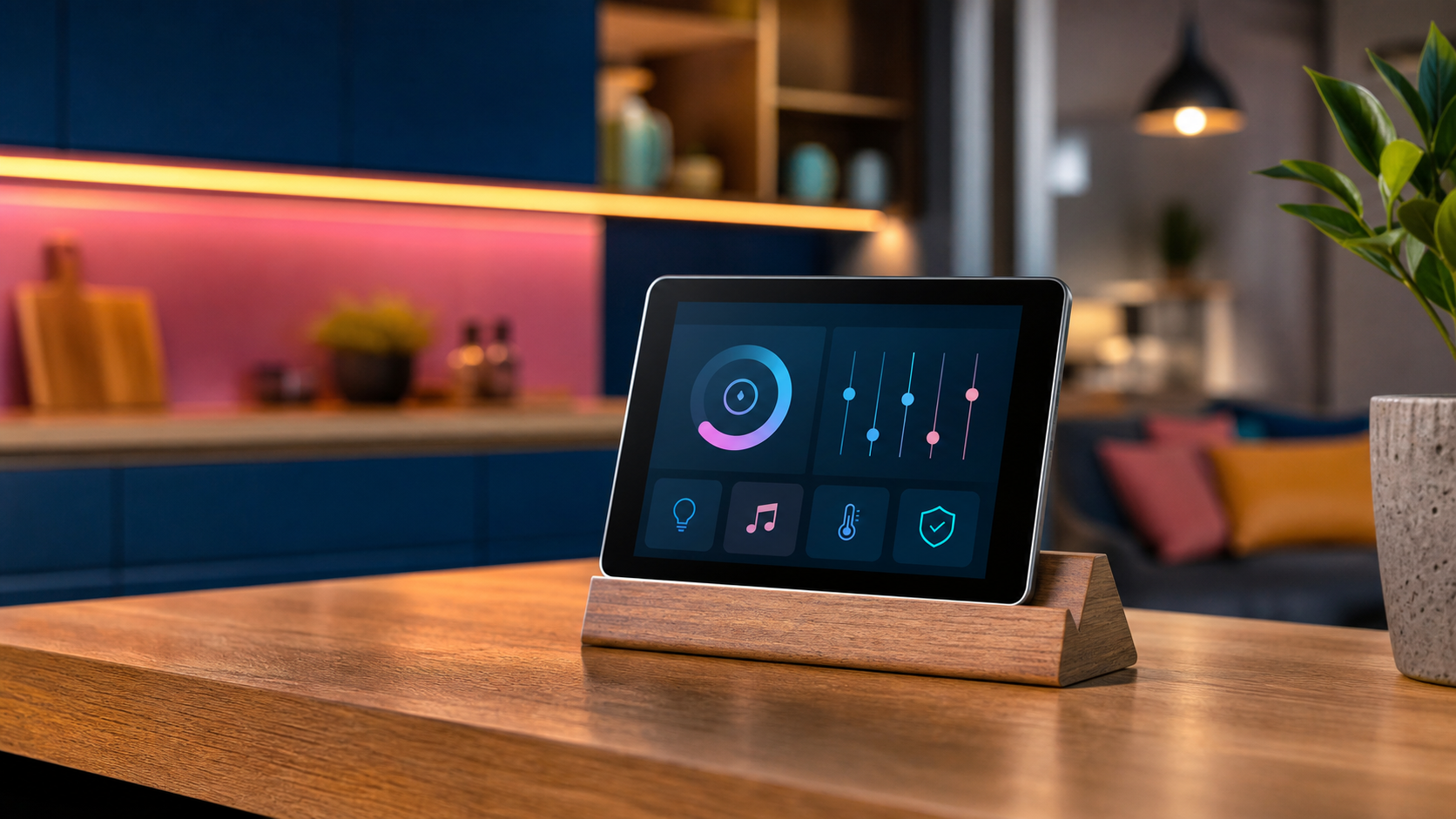
    An older tablet reused as a smart-home controller on a wooden stand

    An older iPad often reaches an awkward stage: too slow or unsupported for everyday use, yet far too capable for a drawer. Its value returns when it stops pretending to be a general-purpose computer and receives one clear job.

    A calm home controller

    Mounted near an entrance or placed on a stand, a tablet can provide simple access to lights, heating, door status and scenes. Keep the interface focused and hide administrative controls. Use guided access or a kiosk-style mode where appropriate so the screen reliably returns to its purpose.

    A dedicated music companion

    A tablet makes an excellent controller for a network player, receiver or local music library. Album artwork gets room to breathe, browsing remains separate from the phone, and guests can choose music without receiving access to personal messages and accounts.

    A kitchen reference

    Recipes, timers and a shared shopping list are a natural fit. Use a washable stand positioned away from steam and direct heat. Increase text size and keep the display awake only while needed; permanent full brightness will shorten the remaining battery life.

    A distraction-light reading screen

    Remove social apps, disable unnecessary notifications and keep only books, magazines or saved articles. A device can feel surprisingly new when it is no longer responsible for every digital habit at once.

    Respect the battery

    An aging lithium battery deserves attention. Check for swelling, unusual heat and rapid voltage loss. Avoid trapping the tablet in a sealed mount, and do not leave questionable hardware charging unattended. If the battery is unsafe, recycling is the correct upgrade.

    The point is not to force obsolete technology to live forever. It is to give capable hardware a smaller, clearer role before asking the recycling stream to deal with it.

  • Buttons Are Back: Why Physical Controls Still Win

    Close-up arrangement of tactile knobs, switches and dials

    A touchscreen can become anything, which is precisely its problem. The same glass rectangle controls volume, temperature, navigation and settings, but it never tells your hand what it is before it lights up. Physical controls do. Shape, resistance and position turn interaction into memory.

    Eyes belong elsewhere

    A volume knob can be found and adjusted without interrupting a conversation. A tactile camera dial communicates its position before the shutter is pressed. Controls used while driving, cooking or listening should not demand visual confirmation for every small change.

    Resistance communicates

    The weight of a switch, the detents of a dial and the travel of a key all provide information. Good resistance prevents accidental input and makes an action feel deliberate. This is not nostalgia; it is a compact feedback system that requires no animation or notification sound.

    Dedicated means dependable

    A physical control usually does one thing, immediately. Software controls can move after an update, disappear behind a modal or become unavailable when the interface freezes. Dedicated controls are valuable for frequent actions because their location and purpose remain stable.

    Hybrid is the answer

    Not every function deserves its own button. Deep settings and infrequent options fit naturally on screens. The strongest products combine adaptable software with tactile controls for the actions people perform constantly: power, volume, playback, temperature and capture.

    Design for the hand

    Controls should be distinguishable by shape and spacing, not merely labels. Important actions need room around them. Similar buttons performing opposite functions should not be identical when they can be used without looking.

    The future does not need to abandon screens. It needs to remember that people have hands—and that a satisfying click can be more informative than an entire interface.

  • Kill the Big Light: A Better Way to Illuminate a Room

    A living room illuminated by layered floor, table and indirect lamps

    The ceiling light is efficient in the same way a supermarket is efficient: everything is visible, but almost nothing looks flattering. Homes need more than maximum illumination. They need pockets of light that support reading, cooking, conversation and the highly technical activity of doing absolutely nothing.

    Think in layers

    Ambient light establishes the room’s general brightness. Task light helps with a specific activity. Accent light gives depth to walls, objects and corners. A comfortable room usually combines all three at lower intensity instead of asking one fixture to perform every job.

    Light the edges

    Dark corners make a room feel smaller, while gently illuminated walls create depth. A floor lamp aimed toward a wall, a small lamp on a low cabinet or a shaded light near a corner can change the perceived size of the room without increasing overall brightness dramatically.

    Put light where life happens

    A reading chair needs a controllable lamp near shoulder height. A dining table benefits from a focused pendant that leaves the surrounding room softer. Kitchen worktops need direct, shadow-free light. Start with activities and positions before choosing fixtures.

    Control glare

    An exposed bright bulb at eye level is tiring even when the room looks atmospheric in photographs. Shades, diffusers and reflected light soften contrast. Sit in the places you actually use and check whether the source is visible. Good lighting should reveal the room, not interrogate its occupants.

    Choose warmth intentionally

    Warm light generally suits living areas, while neutral light can help in workspaces. Consistency within a sightline matters: wildly different color temperatures make adjoining areas feel accidental. Dimming is often more valuable than chasing a single perfect specification.

    Keep the big light for finding a lost earring. For living, build a small constellation instead.

  • Why Colorful Furniture Makes Minimalist Rooms Better

    A sculptural yellow chair in a warm minimalist living room

    Minimalism is often mistaken for a restricted palette of white, grey and apologetic beige. But the real strength of a minimal room is editing: fewer objects, clearer relationships and enough space for each choice to matter. That makes color more powerful, not less.

    Color creates hierarchy

    In a quiet room, one saturated chair or cabinet immediately establishes a focal point. The eye understands where to land, and the surrounding furniture can become simpler. Without that anchor, a restrained interior sometimes compensates with too many small decorative objects.

    Choose a useful protagonist

    The colorful object should earn its floor space. A chair, lamp, rug or storage unit works better than an ornament because it combines visual impact with daily use. The goal is not to place a random bright object in the corner. It is to choose something whose form deserves attention.

    Repeat, but barely

    A dominant color feels more intentional when it appears once or twice elsewhere at a much smaller scale: a book spine, a line in an artwork or a ceramic detail. Exact matching is unnecessary. Related tones create rhythm without turning the room into a themed display.

    Let materials calm it down

    Wood, brushed metal, wool and natural stone give saturated colors something grounded to push against. Texture also keeps neutral areas from feeling empty. A bright lacquered cabinet beside warm timber feels richer than the same cabinet surrounded entirely by glossy white surfaces.

    Live with samples

    Color changes dramatically across daylight, evening lamps and screen photographs. Test a large sample in the actual room and observe it for several days. The exciting yellow in a showroom may become acidic under a cool lamp; a deep burgundy may become the warmest element in the house.

    A minimal interior does not need less personality. It needs fewer, stronger decisions. Sometimes one gloriously colorful piece is the most minimal choice available.

  • The Home Dashboard That Refuses to Become Another Chore

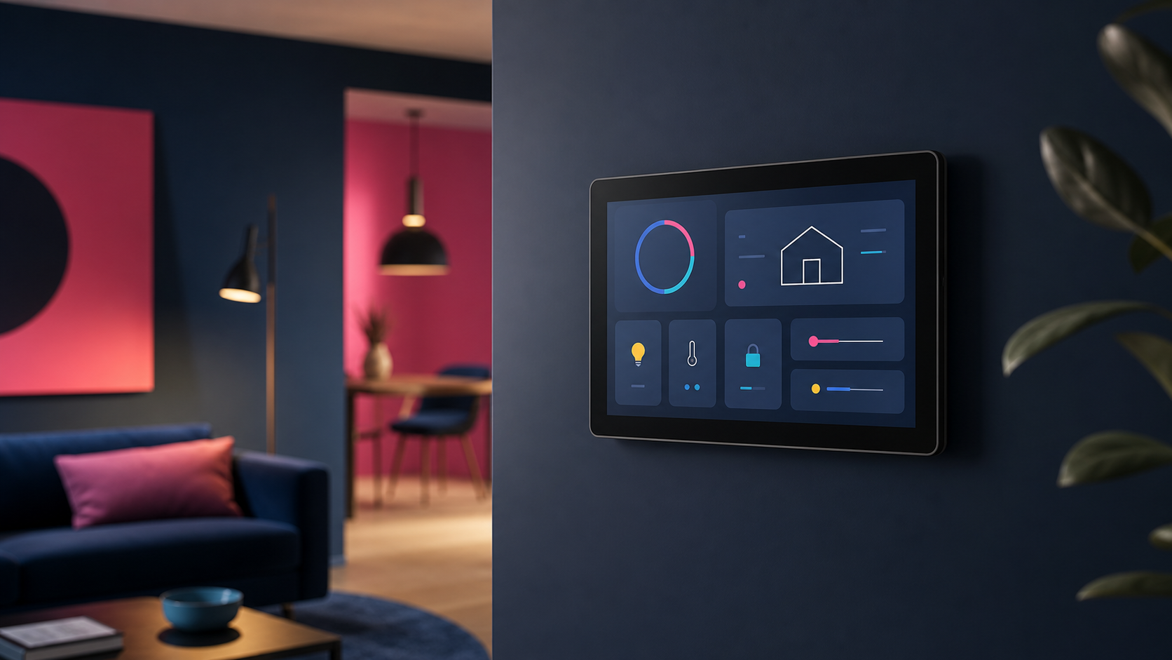
    A simple wall-mounted smart-home dashboard in a colorful interior

    Home dashboards have a habit of becoming museums of available data. CPU graphs, weather tiles, battery percentages and twelve tiny icons compete for attention, while the one useful answer—whether the back door is locked—requires scrolling. A good dashboard is not a control panel for everything. It is a shortcut to the next sensible action.

    Design around moments

    Think about when the screen is used. The morning view might show weather, travel time and the state of important doors. An evening view can prioritize lights, heating and media. A maintenance view may expose server health and low batteries. One permanent wall of widgets rarely serves all three moments well.

    Show exceptions first

    Normal systems do not need attention. Replace a sea of green indicators with a quiet status summary and reveal detail only when something is wrong. A single “everything is okay” message is calmer and more informative than twenty green circles.

    Keep controls forgiving

    Large targets, clear labels and immediate feedback matter more than visual cleverness. Avoid controls whose effect is ambiguous. If a button starts a scene, show what changed. If an action is risky, separate it from everyday controls and require confirmation.

    Respect the household

    A dashboard should make sense to someone who did not build it. Use ordinary language rather than entity IDs and technical abbreviations. Ask other people which tasks they actually want on the screen. Their answer may be “none,” which is also useful design feedback.

    Delete relentlessly

    If a card has not influenced a decision in a month, remove it. The underlying metric can remain available in a diagnostic tool. The shared dashboard should stay focused on information that changes what someone does next.

    The best home dashboard feels less like mission control and more like a good light switch: obvious, dependable and almost invisible.

  • Backups Are Boring Until Restore Day

    Multiple independent data vaults restoring a protected file

    Backup dashboards are excellent at producing green check marks. Unfortunately, a green check mark usually proves only that a job ran. It does not prove that the right files were captured, the archive can be opened or the recovery instructions make sense when the original system is gone.

    Start with consequences

    Classify data by what its loss would mean. Family photos and original work may be irreplaceable. Application containers can often be recreated, but their databases and configuration cannot. Downloaded media may be large yet replaceable. This distinction determines how many copies you need and how quickly each one must return.

    Use independent copies

    A useful baseline is multiple copies on different storage, with at least one outside the home. Independence matters. A second folder on the same machine is not protection from disk failure, malware or accidental deletion. An attached backup drive may disappear in the same electrical event as the server it protects.

    Protect the instructions

    Recovery documentation belongs outside the system being recovered. Record where backups live, how they are encrypted, which credentials are required and the order in which services should return. Include enough detail for a tired future version of yourself who no longer remembers the clever shortcut used two years ago.

    Restore small things often

    Choose a file every month and recover it to a temporary location. Periodically restore an application into an isolated environment and verify that it starts. These tests expose missing volumes, incomplete database dumps and forgotten encryption keys while the original system still exists.

    Measure recovery, not storage

    A tiny configuration file may matter more than a terabyte of replaceable media. Track the time needed to restore important services, not merely the capacity consumed by backups. Recovery time is the number that matters during an incident.

    Backups should be boring. Restore day should be boring too. That only happens when recovery is practiced before it becomes urgent.