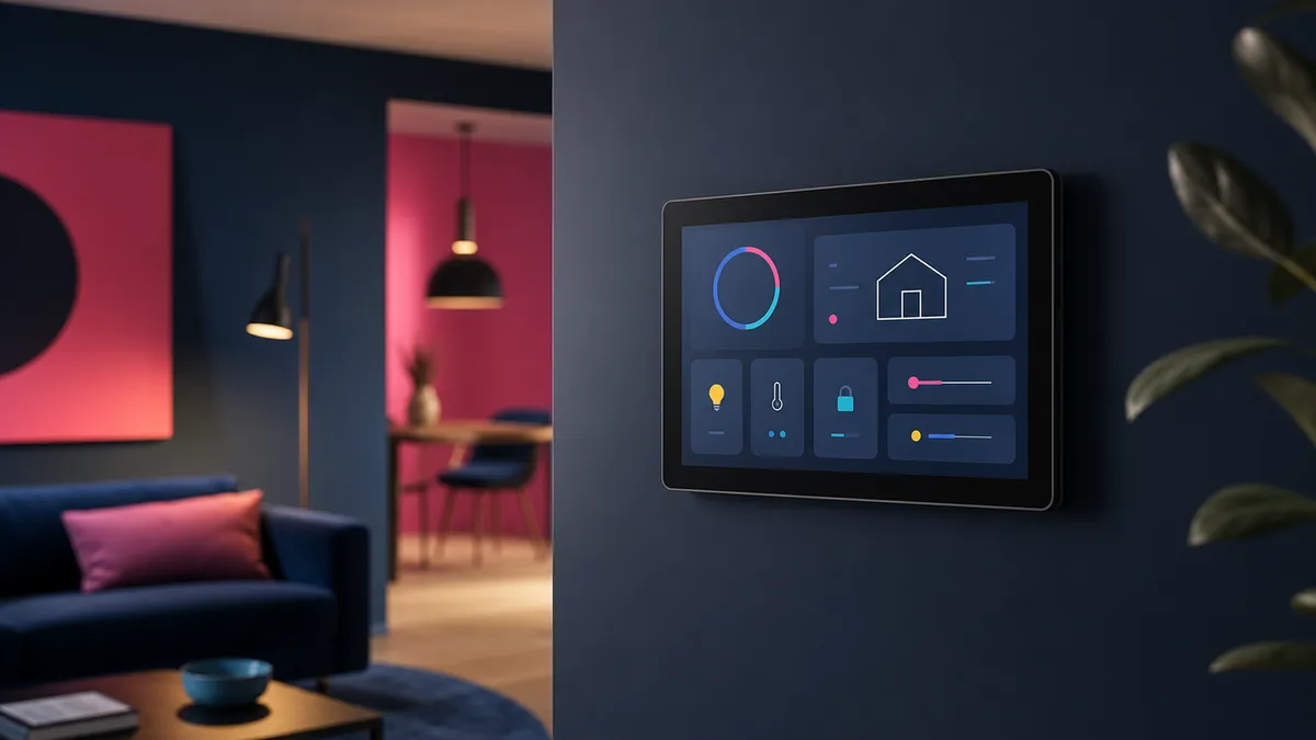
Home dashboards have a habit of becoming museums of available data. CPU graphs, weather tiles, battery percentages and twelve tiny icons compete for attention, while the one useful answer—whether the back door is locked—requires scrolling. A good dashboard is not a control panel for everything. It is a shortcut to the next sensible action.
Design around moments
Think about when the screen is used. The morning view might show weather, travel time and the state of important doors. An evening view can prioritize lights, heating and media. A maintenance view may expose server health and low batteries. One permanent wall of widgets rarely serves all three moments well.
Show exceptions first
Normal systems do not need attention. Replace a sea of green indicators with a quiet status summary and reveal detail only when something is wrong. A single “everything is okay” message is calmer and more informative than twenty green circles.
Keep controls forgiving
Large targets, clear labels and immediate feedback matter more than visual cleverness. Avoid controls whose effect is ambiguous. If a button starts a scene, show what changed. If an action is risky, separate it from everyday controls and require confirmation.
Respect the household
A dashboard should make sense to someone who did not build it. Use ordinary language rather than entity IDs and technical abbreviations. Ask other people which tasks they actually want on the screen. Their answer may be “none,” which is also useful design feedback.
Delete relentlessly
If a card has not influenced a decision in a month, remove it. The underlying metric can remain available in a diagnostic tool. The shared dashboard should stay focused on information that changes what someone does next.
The best home dashboard feels less like mission control and more like a good light switch: obvious, dependable and almost invisible.
Leave a Reply