Author: chat gpt

  • Cloudflare, DDNS and a Changing Home IP: My Actual Setup

    Cloudflare, DDNS and a Changing Home IP: My Actual Setup

    CloudOnFire runs from a residential internet connection with an address that can change. The trick is not pretending that a home connection behaves like a data centre. It is designing the public edge, DNS updates and origin server so that a routine address change becomes boring—and so that publishing the architecture does not publish an attack map.

    Abstract illustration of a home server protected by a cloud edge while network addresses change
    The pattern, deliberately abstracted: home origin, protected edge and an address that can move.

    The architecture in one paragraph

    A small web server lives inside an isolated virtualised environment on the home network. The domain’s authoritative DNS is managed at the cloud edge and public requests are proxied before reaching the origin. A tiny Dynamic DNS updater checks the residential public address and changes one designated DNS record only when necessary.

    That is the complete public description. Internal addresses, container identifiers, usernames, management paths and exact firewall configuration remain private because none of them would make this article more useful.

    Dynamic DNS should have one small job

    The updater needs permission to modify the relevant DNS record—not the entire account. The credential should be scoped to one zone and the minimum required DNS-edit capability. It belongs in protected configuration, never in a script pasted into a post, a screenshot, a shell-history tutorial or a public repository.

    The update interval does not need to be frantic. The client can compare the current public address with the existing DNS value, update only after a genuine change and log success without printing secrets.

    The safest automation is boring, narrowly authorised and almost invisible.

    The proxy is helpful, not magical

    Proxying through Cloudflare keeps normal visitors away from a direct origin connection and provides TLS termination, caching and traffic filtering. It does not automatically secure the machine behind it. If the origin still accepts arbitrary traffic from the entire internet, discovering the residential address can allow someone to bypass many edge protections.

    A stronger design limits web traffic at the origin to trusted proxy networks where practical, keeps the firewall explicit and exposes only what the public site actually needs. The hypervisor, database, SSH and container-management interfaces never belong on the public web.

    TLS all the way to the origin

    The browser-to-edge connection is only half of the journey. The edge-to-origin connection should also use valid TLS with strict certificate validation. “Flexible” encryption may look convenient, but it leaves the final leg unencrypted and can create confusing redirects. Full strict validation is the goal.

    WordPress is part of the security boundary

    The network can be beautifully designed and still be undermined by an abandoned plugin or weak administrator account. Themes and plugins stay updated, unused components are removed or disabled, administrator accounts are kept to a minimum and authentication is protected with MFA or a strong identity provider.

    The database is reachable only from the application environment. Backups are stored separately and restoration is tested rather than assumed. A backup that has never been restored is merely a theory.

    What I deliberately do not publish

    • The current or historical public IP address
    • Internal subnets, hostnames or container IDs
    • Router, hypervisor or operating-system fingerprints
    • Exact port-forwarding and management rules
    • API tokens, client secrets or screenshots containing them
    • The location of administration interfaces
    • Backup destinations and recovery credentials

    The lessons worth sharing

    Use narrowly scoped credentials. Separate public services from management. Encrypt both sides of the proxy. Assume addresses change. Keep the origin patched. Test recovery. Document the principles publicly and the implementation details privately.

    A changing home IP is not the interesting problem. The interesting problem is building a system in which change does not tempt you to weaken everything else.

    This article intentionally describes a general security pattern, not a reproducible map of the live CloudOnFire network. Configuration should be adapted to your own threat model and verified against current vendor documentation.
  • The Yellow Retreat: Why Vitra’s Grand Repos Owns the Window

    The Yellow Retreat: Why Vitra’s Grand Repos Owns the Window

    The yellow chair by the open window looks cheerful. Underneath, it is doing serious engineering. Vitra’s Grand Repos, designed by Antonio Citterio in 2011, is a contemporary wing chair built around movement: it supports the body from upright conversation to fully reclined retreat without advertising the mechanism that makes it possible.

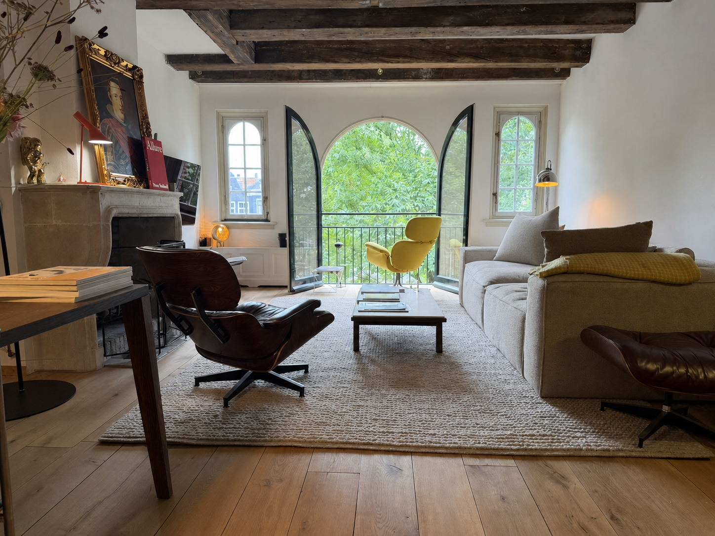
    Yellow Vitra Grand Repos by an open arched window
    Grand Repos in yellow: part shelter, part machine, and impossible to ignore.

    A wing chair without nostalgia

    The high back and projecting head section connect Grand Repos to the traditional wing chair, but Citterio removes the historical decoration. The volumes are broad and protective; the seams give the upholstery just enough structure; the swivel base keeps the object visually lighter than its comfort suggests.

    The result feels architectural. It creates a room within the room, especially when placed near a window or away from a wall. From behind, the chair reads as a single strong silhouette. From the seat, the wings reduce peripheral distraction and make reading or listening feel private.

    The hidden mechanism

    Vitra describes a synchronised mechanism concealed beneath the upholstery. Backrest and seat respond together as the sitter changes position, and the chair can be locked at different reclining angles. Resistance can be adjusted to suit the user’s weight.

    This is the opposite philosophy from a visibly mechanical office chair. Grand Repos hides the technology so that comfort feels intuitive. The lever is present, but the chair never looks like equipment.

    Why yellow changes everything

    In a neutral fabric, Grand Repos can behave as quiet background architecture. Yellow turns its protective form into something optimistic. Against green trees outside the window, the chair becomes almost graphic—a warm shape floating between the pale room and the view.

    It also prevents the interior’s celebrated classics from becoming too reverent. A burgundy Eames Lounge Chair is dark, grounded and materially rich. Grand Repos is bright, upright and visually buoyant. Their disagreement is what makes the pairing work.

    A room becomes personal when excellent objects are allowed to argue with one another.

    Contemporary comfort among older icons

    Grand Repos is decades younger than the Eames Lounge Chair and Cees Braakman’s Pastoe seating. It does not need to imitate either. Instead, it demonstrates how the lounge-chair problem evolved: the fixed geometry of mid-century design gives way to adjustable support, removable upholstery and a mechanism engineered around different bodies and postures.

    The chair earns its place not because it is collectible, but because it is used. It faces the view, catches the changing daylight and offers the most naturally private seat in an otherwise open room.

    Model information: Vitra Grand Repos — Antonio Citterio, 2011.

  • Burgundy, Yellow and Black: An Eames Lounge Chair in Good Company

    Burgundy, Yellow and Black: An Eames Lounge Chair in Good Company

    A burgundy Eames Lounge Chair does not disappear into a room—and it should not. The deep leather, curved wooden shells and black aluminium base create a silhouette that is generous without becoming bulky. It is an icon, certainly, but the real pleasure begins when it stops behaving like museum furniture and becomes part of everyday life.

    Burgundy Eames Lounge Chair in an Amsterdam living room with a yellow Grand Repos
    Burgundy leather, dark shells and a room that happily mixes design generations. Editorial image based on the actual interior.

    The chair that changed the idea of modern comfort

    Charles and Ray Eames introduced the Lounge Chair and Ottoman in 1956. Instead of the visual austerity associated with much early modern furniture, it offered softness, warmth and the relaxed character of a well-used club chair—reinterpreted through moulded plywood and industrial production.

    Vitra has produced the chair in Europe since the 1950s using methods that remain close to the original. The relationship between the three curved shells and loose cushions is the essential idea: structure and softness remain visibly separate, which keeps the chair from looking heavy.

    Why burgundy is better than safe black

    Black leather is canonical. Burgundy is personal. It brings out the reddish warmth in the wood veneer and changes throughout the day, moving from near-brown in shadow to wine-red in direct light. Marks and creases become part of that colour rather than flaws to be corrected.

    The chair works especially well among old beams, stone, books and imperfect materials. Its precision gives the room structure; the leather prevents that precision from feeling cold.

    The best original design is not protected from life. It becomes better evidence of it.

    Across the room: Grand Repos in yellow

    The yellow chair in the background is not another Eames. It is Vitra’s Grand Repos, designed by Antonio Citterio in 2011. Its concealed synchronised mechanism allows the backrest to recline and lock at different angles. Where the Eames Lounge Chair makes its construction visible, Grand Repos hides the engineering inside generous upholstery.

    The combination is more interesting than a matching pair. Burgundy and yellow create tension; American mid-century optimism meets contemporary Italian precision; one chair cradles through fixed geometry while the other moves with the sitter.

    The quieter counterpoint: Cees Braakman’s SM07

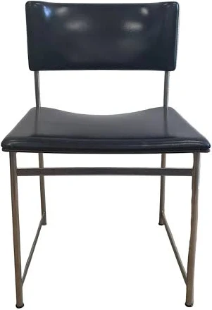
    Elsewhere in the interior, the black dining chairs appear to be the SM07 designed by Dutch modernist Cees Braakman for UMS Pastoe’s Japanese Series around the turn of the 1960s. Their slender chromed-steel frames and black upholstery use almost nothing to describe a chair.

    Black Pastoe SM07 dining chair attributed to Cees Braakman
    The likely Pastoe SM07: visually light, geometrically direct and unmistakably Dutch. Reference image; labels and construction should be checked for definitive authentication.

    Braakman’s restraint is the necessary counterweight to the lounge chairs. The SM07 does not compete for attention. Its thin rectangular frame allows architecture and people to remain visible through it. That visual economy is why a sixty-year-old dining chair can still feel current.

    An interior built through contrast

    Good rooms rarely come from buying a complete collection at once. They grow through differences: sculptural lighting against old stone, a technically complex recliner beside a 1950s icon, and minimal Dutch dining chairs holding the composition together.

    The Eames remains the emotional centre—not because it is famous, but because burgundy leather gives a highly recognisable object a specific life and place.

    Further reading: Vitra Lounge Chair and Vitra Grand Repos.

  • Electric Orange, Perfect Angle: Living With the Louis Poulsen AJ Table

    Electric Orange, Perfect Angle: Living With the Louis Poulsen AJ Table

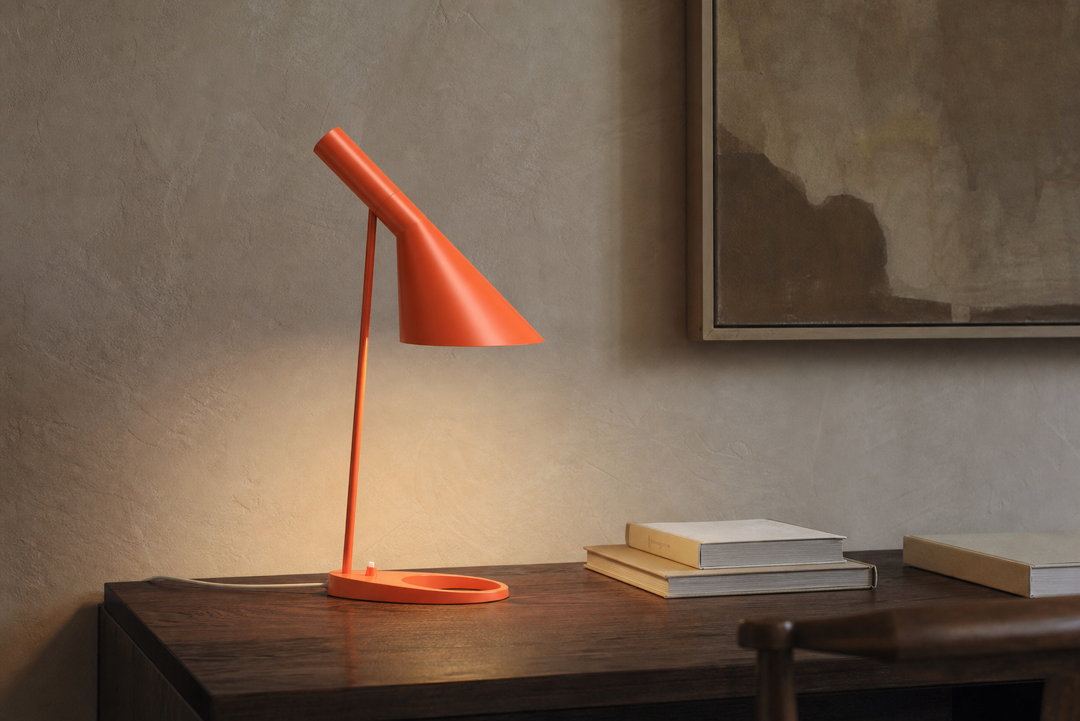
    Some lamps illuminate a room. The AJ Table lamp edits it. A sharp cone of light, one decisive diagonal and a colour that refuses to whisper: in Electric Orange, Arne Jacobsen’s familiar silhouette becomes less like an appliance and more like punctuation.

    Louis Poulsen AJ Table lamp in Electric Orange on a dark wooden desk
    The AJ Table in Electric Orange. Editorial image based on the lamp’s original form.

    Designed as part of a complete world

    Jacobsen designed the AJ family for Copenhagen’s SAS Royal Hotel, where architecture, furniture, textiles and lighting were conceived as a single environment. The lamp’s asymmetric shade directs light exactly where it is needed while shielding the eye from glare. That practical purpose is what gives the object its unmistakable expression.

    The shape looks effortless, but it is full of tension: a heavy oval base, a thin vertical stem and a shade that appears to lean forward with intent. Nothing is decorative in the usual sense. The character comes from proportion and direction.

    Why Electric Orange works

    In black or white, the AJ can behave almost like architectural hardware. Electric Orange changes the conversation. It makes the lamp visible even when switched off and brings warmth to stone, dark wood, old paintings and stacks of books.

    That is precisely why it works in an interior that mixes periods. The orange does not attempt to match the room. It gives the eye a point of focus and prevents a collection of serious design objects from becoming too polite.

    A good accent colour does not ask permission from the rest of the room.

    Light with boundaries

    The AJ is not designed to fill every corner with uniform brightness. It creates a controlled pool of light for reading, working or highlighting an object. The shade can be adjusted, turning illumination into something composed rather than merely available.

    This makes it especially effective in the evening. Instead of flattening the room with ceiling lights, one lamp produces contrast: a bright page, a glowing wall and shadows that allow materials to keep their depth.

    A design that still feels direct

    Many mid-century objects survive because nostalgia protects them. The AJ survives because it remains useful. Its form is graphic without becoming a logo, recognisable without becoming fragile, and expressive without demanding an empty gallery around it.

    Louis Poulsen still produces the AJ Table in several finishes, including Electric Orange. The continuing appeal is easy to understand: it solves a lighting problem and, almost as a side effect, gives the entire room more confidence.

    Product background and current specifications: Louis Poulsen AJ Table documentation.

  • The Long Way West: A Northern Spain Road Trip

    The Long Way West: A Northern Spain Road Trip

    The northern coast of Spain does not reveal itself all at once. It arrives in fragments: a flash of Atlantic blue between eucalyptus trees, a stone harbour at the bottom of a hill, the smell of woodsmoke outside a roadside bar. The quickest route west is perfectly competent. The coastal route is much better.

    This journey begins in Bilbao and follows the Bay of Biscay through Cantabria and Asturias. There is no strict checklist. The idea is to keep the ocean on the right, choose the smaller road whenever it looks interesting and stop before the scenery becomes background noise.

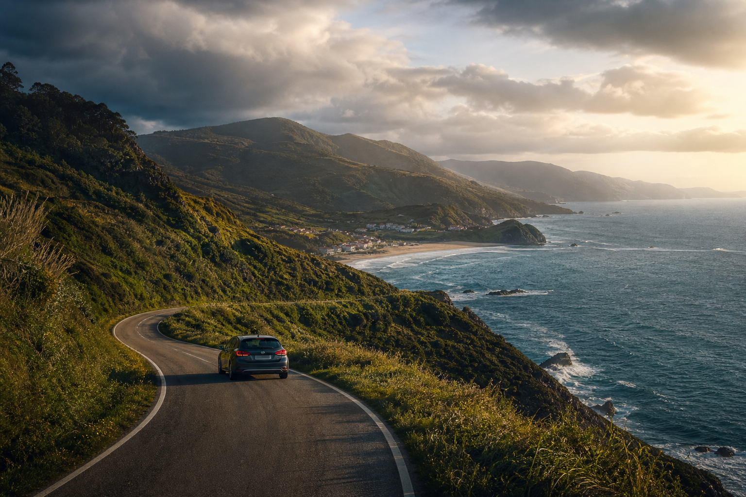
    A car following a winding road above Spain’s northern Atlantic coast
    The road west, where every bend suggests another unscheduled stop. Editorial illustration.

    Bilbao in the rear-view mirror

    Bilbao is a difficult city to leave early. There is always another coffee, another pintxo and another building that deserves a detour. But once the city loosens its grip, the landscape changes quickly. Industry gives way to steep green slopes and glimpses of water. The motorway offers speed; the old coast road offers a story.

    The first useful rule of this trip is simple: do not measure progress in kilometres. A short distance can contain a fishing port, a cliff walk, two plates of anchovies and an unexpectedly serious conversation about cider. This is not inefficiency. This is the entire point.

    Castro Urdiales: the first taste of the coast

    Castro Urdiales feels like a transition between urban northern Spain and the wilder coast ahead. Its medieval church stands above a harbour filled with working boats and weekend walkers. The promenade is polished, but the smell of salt and diesel keeps it honest.

    It is an ideal first stop: long enough to stretch the legs, short enough not to destroy the day. Walk around the old harbour, order something from the sea and resist the urge to convert the journey into an optimised spreadsheet.

    The best road trips leave enough empty space for a place you did not know you needed.

    West through Cantabria

    Beyond Castro Urdiales, the road begins its rhythm of green headland, pale beach and compact town. San Vicente de la Barquera appears almost theatrically, with water on both sides and mountains rising behind it. On a clear day the Picos de Europa hover in the distance like scenery borrowed from another trip.

    Lunch is best kept uncomplicated: grilled fish, tortilla, bread and a cold drink. Northern Spain rewards appetite but punishes over-planning. Choose the busy room, order what seems to be moving fastest from kitchen to table and save the research for later.

    Llanes after the day-trippers leave

    Llanes is the kind of place that changes character by the hour. During the day, the harbour and old town are animated. Toward evening, the streets empty, shutters close and the sea becomes louder. Above town, the Paseo de San Pedro runs along a grassy cliff with views that make every phone camera look briefly competent.

    The harbour wall is protected by the Cubes of Memory, giant concrete blocks transformed into bright geometric art. They are playful, slightly strange and completely at home against the grey Atlantic. It is a good reminder that coastal towns do not have to choose between tradition and personality.

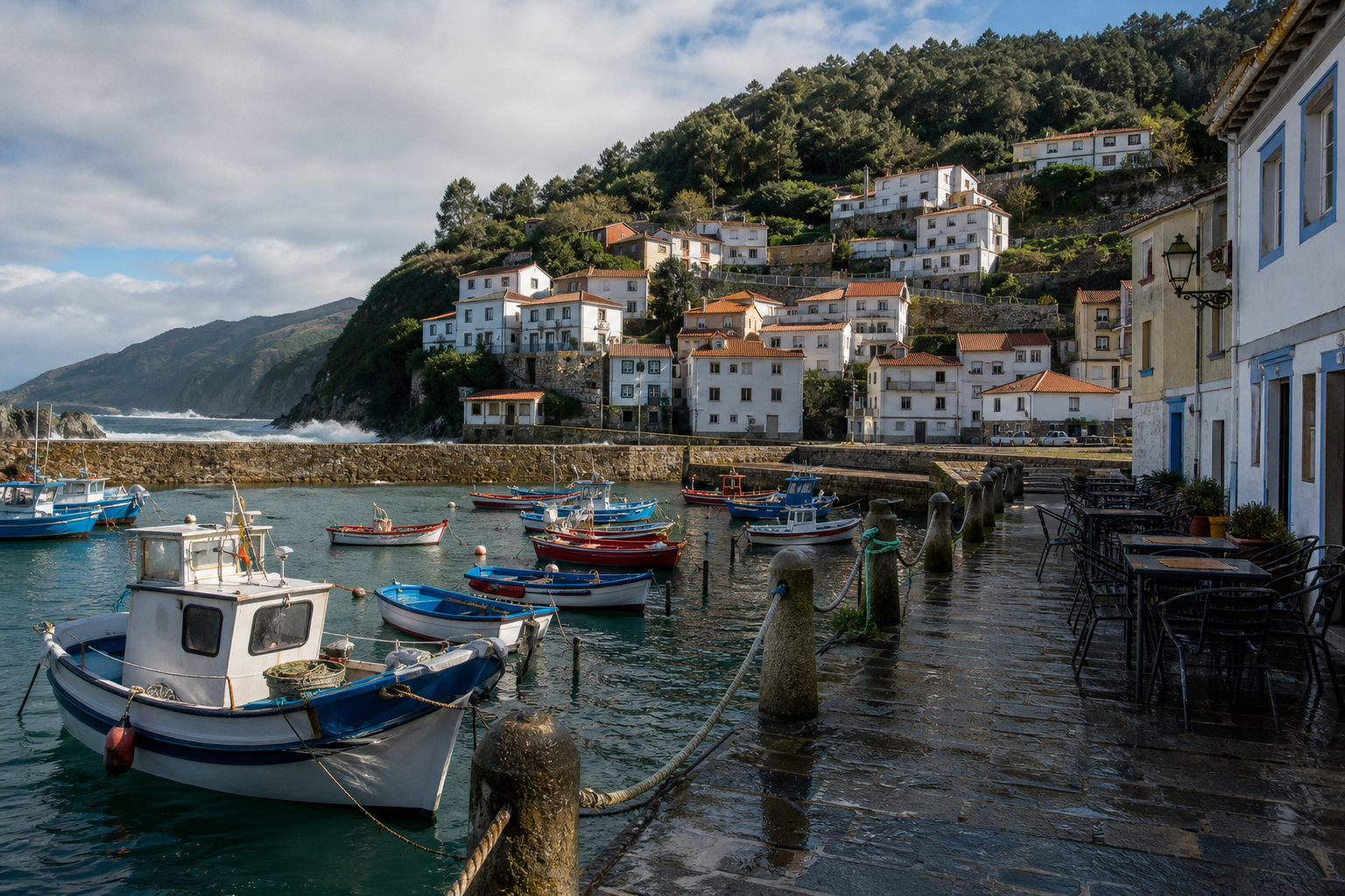
    Colourful boats in a quiet fishing harbour on Spain’s north coast
    A rain-washed harbour somewhere between the mountains and the Atlantic. Editorial illustration.

    The smaller road into Asturias

    Asturias announces itself through scale. The cliffs feel taller, the beaches more hidden and the valleys more intensely green. The main road is excellent, but the memorable sections are the exits that drop toward villages whose names were never part of the plan.

    Ribadesella offers a broad estuary and elegant seaside houses. Cudillero is a cascade of colour around a tiny amphitheatre-shaped harbour. Luarca spreads across two hills, joined by bridges and watched over by a white cemetery high above the sea. Each place could absorb a day; on a road trip, each becomes a vivid chapter.

    A quiet base in the west

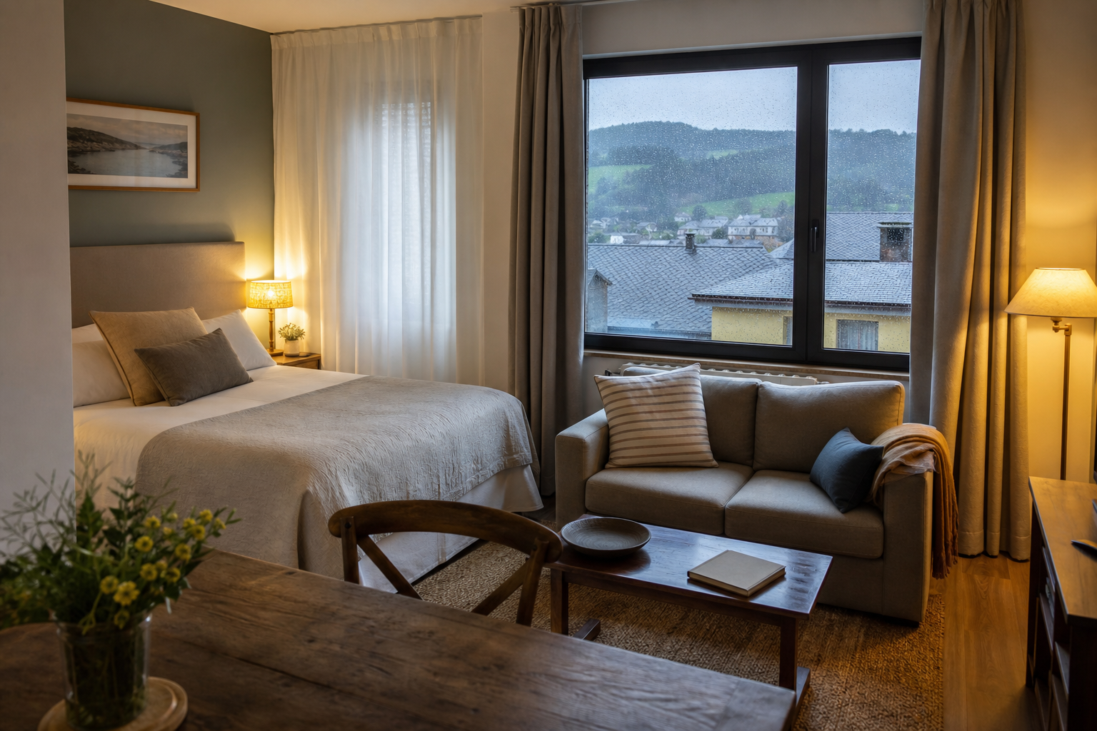
    Eventually, constant movement loses its charm. A small apartment-style hotel in western Asturias makes a useful base: enough room to unpack, a table for maps and snacks, and a window that turns rainfall into atmosphere rather than inconvenience.

    A warm apartment-hotel room overlooking green hills after rain
    The essential road-trip luxury: warmth, space and nowhere else to be. Fictional editorial illustration, not a photograph of a specific hotel.

    The pleasure of staying put is that the surrounding coast can be explored without luggage or deadlines. Puerto de Vega is close enough for a morning wander around the harbour. Luarca works for lunch and a long walk. The Senda Costera Naviega offers the purest version of the landscape: cliffs, fields, beaches and the Atlantic repeatedly disappearing and returning.

    What the road teaches you

    There are more spectacular drives in Europe and more famous coastal cities. What makes northern Spain special is the density of small rewards. A dramatic view rarely needs a ticket. A memorable meal may arrive in a room with fluorescent lighting. The hotel that feels best is often the one that lets wet coats dry and provides a proper table for tomorrow’s plan.

    The weather is part of the composition. Rain sharpens the slate roofs. Cloud gives the green landscape depth. When the sun breaks through, the entire coast seems to switch on at once.

    A deliberately incomplete itinerary

    • Begin in Bilbao, but leave enough daylight for the road.
    • Pause in Castro Urdiales for the harbour and old quarter.
    • Choose one Cantabrian stop rather than collecting them all.
    • Walk above Llanes before dinner.
    • Let Asturias slow the journey down with harbour towns and cliff paths.
    • Stay somewhere practical and warm, then explore without luggage.

    This is not a route to complete. It is a route to interrupt. Take the exit, order the local thing, walk until the weather changes and keep the Atlantic close. The long way west is not the detour. It is the destination.

    All photographs in this story are original editorial illustrations created for CloudOnFire. They evoke the journey without depicting a specific booking, property or private traveller.

  • Paella at HORTA, Amsterdam Zuid: Exactly the Right Kind of Excess

    Paella at HORTA, Amsterdam Zuid: Exactly the Right Kind of Excess

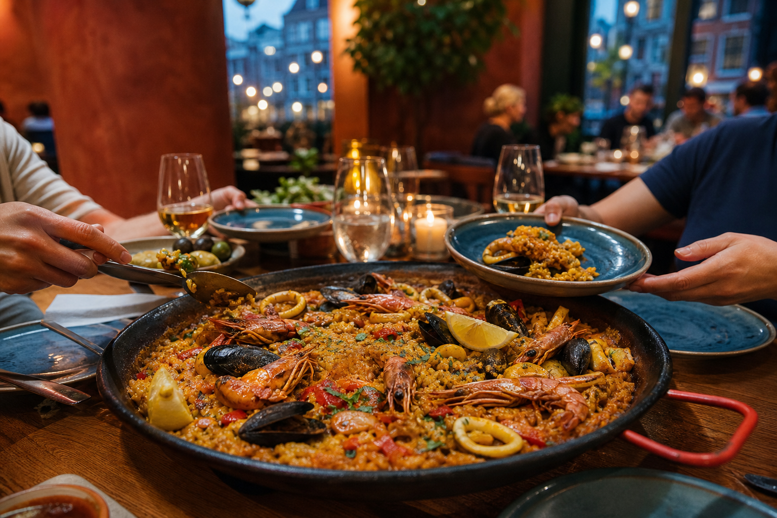
    A generous seafood paella shared at a warm restaurant table

    There are evenings that call for a delicate sequence of small plates. And there are evenings when someone should put an enormous pan of saffron rice in the middle of the table and let everybody become quiet for a moment.

    HORTA, the Spanish restaurant near Amsterdam Zuid, is built for the second kind of evening.

    The pan arrives

    Paella is theatre before it is dinner. You smell the toasted rice and stock first. Then come the prawns, mussels, squid, peppers and lemon, all competing for attention. The best part is the socarrat: that caramelised layer on the bottom of the pan that makes otherwise polite people negotiate over the final spoonful.

    At HORTA, the pleasure is in the sharing. Plates move around, wine gets poured, somebody claims they are completely full and then continues eating directly from the pan. It feels generous and celebratory without requiring a special occasion.

    Amsterdam outside, Spain at the table

    The area around Zuid can feel brisk and businesslike. That contrast makes a warm Spanish meal even better. Inside, the pace changes. Paella is not fast food, and waiting for it is part of the point: order a drink, argue about whether one more starter is sensible, and let the kitchen do its work.

    Is it subtle? Not particularly. Is that a problem? Absolutely not. Saffron, seafood, crispy rice, wine and friends are allowed to be obvious pleasures.

    Verdict: Go hungry, order for the table and defend your share of the socarrat.

    Restaurant: HORTA Amsterdam. Header photograph is an original editorial visual rather than a documentary photo of the restaurant.

  • MOTO STACK: A Filing Cabinet That Escaped and Became Sculpture

    MOTO STACK: A Filing Cabinet That Escaped and Became Sculpture

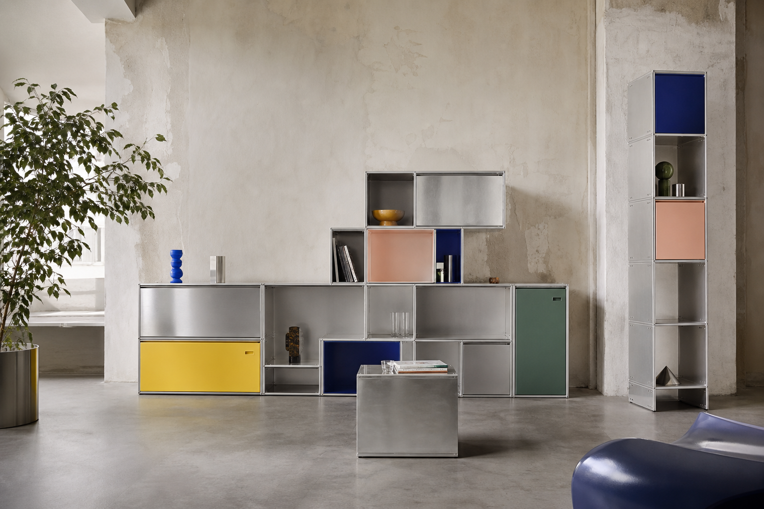
    A colorful modular aluminium cabinet system in a contemporary interior

    Most filing cabinets look as if they were designed to make paperwork feel even less exciting. STACK, the modular aluminium furniture system by Belgian architecture duo studio MOTO, takes the opposite approach. It turns storage into a construction kit.

    Architects Thomas Hick and Mo Vandenberghe originally wanted a timeless filing cabinet for their own office—something that could adapt when the room or their needs changed. Unable to find it, they designed it. The result grew into a family of cabinets, shelves, tables and wonderfully unnecessary-looking totems.

    No tools, just hands

    STACK’s cleverest quality is hidden inside its very obvious geometry. The aluminium elements click together without screws or permanent fixings. A configuration can be expanded, rearranged or dismantled as life changes. That makes the system feel less like a finished object and more like an alphabet.

    The brushed metal gives it industrial precision, but the colours stop it from becoming cold. Zinc yellow, peach pink, patina green and cobalt-blue panels turn practical storage into punctuation. One low cabinet can sit quietly against a wall; a tall asymmetrical composition can take over the entire room.

    Furniture for people who keep changing their minds

    Good modular furniture often disappears into the background. STACK refuses. It has the cheerful confidence of a piece of machinery that knows it also looks excellent with books, records, ceramics and one strangely shaped lamp.

    It is not minimalism in the joyless sense. It is orderly, but playful. Precise, but never corporate. And because it can be rebuilt instead of discarded, its flexibility is more than a styling exercise.

    Verdict: A filing cabinet went to architecture school, discovered colour and became the most interesting object in the room.

    Source: MOTO STACK’s official website. Header artwork is an original editorial visual.

  • Madonna’s Confessions II: The Dance Floor Is Sacred Again

    Madonna’s Confessions II: The Dance Floor Is Sacred Again

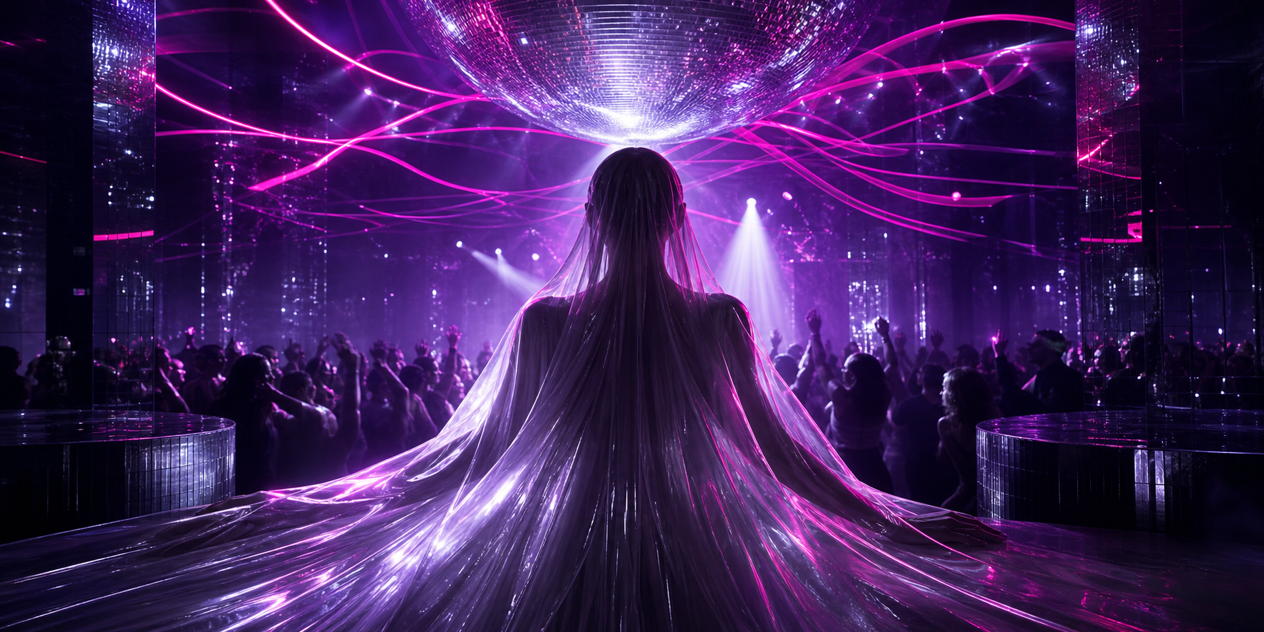
    A futuristic violet dance floor under a mirrored disco ball

    Some records arrive politely. Confessions II kicks open the club doors in a cloud of violet light and demands that everybody move.

    Released on 3 July 2026 through Warner Records, Madonna’s fifteenth studio album is a spiritual sequel to 2005’s Confessions on a Dance Floor. More importantly, it reunites her with producer Stuart Price—and that reunion feels less like nostalgia than unfinished business.

    The original Confessions treated the album as one long night out: seamless, euphoric and just melancholic enough to keep the glitter from becoming empty decoration. Its successor understands the same essential truth. Great dance music is not background noise. It is architecture for bodies, memories and reinvention.

    Back under the mirror ball

    The opening track, “I Feel So Free,” sets out the record’s intentions immediately. Synths rise and circle; the beat moves with purpose; Madonna sounds as if she has rediscovered a room she never truly left. The continuous flow gives the album a wonderfully old-fashioned confidence: this is something to play from beginning to end, preferably loudly and after dark.

    The official release came in an almost comical number of editions—standard and deluxe vinyl, CDs, cassette, digital versions, instrumentals and several special editions. Normally that might feel excessive. For Madonna, excess is part of the grammar.

    Why it works

    What makes Confessions II fantastic is not simply that it resembles a beloved record. It remembers why the original worked. The dance floor can hold pleasure and grief at the same time. Repetition becomes ritual. A bassline can be both ridiculous and profound.

    Twenty-one years later, Madonna is not pretending that time stood still. She is using the club as a place where time briefly stops mattering. That is a much more interesting proposition—and a very Madonna one.

    Verdict: Put away the tasteful playlist. Turn off shuffle. Let the whole thing run.

    Sources: Madonna’s official announcement and official album formats. Header artwork is an original editorial illustration.