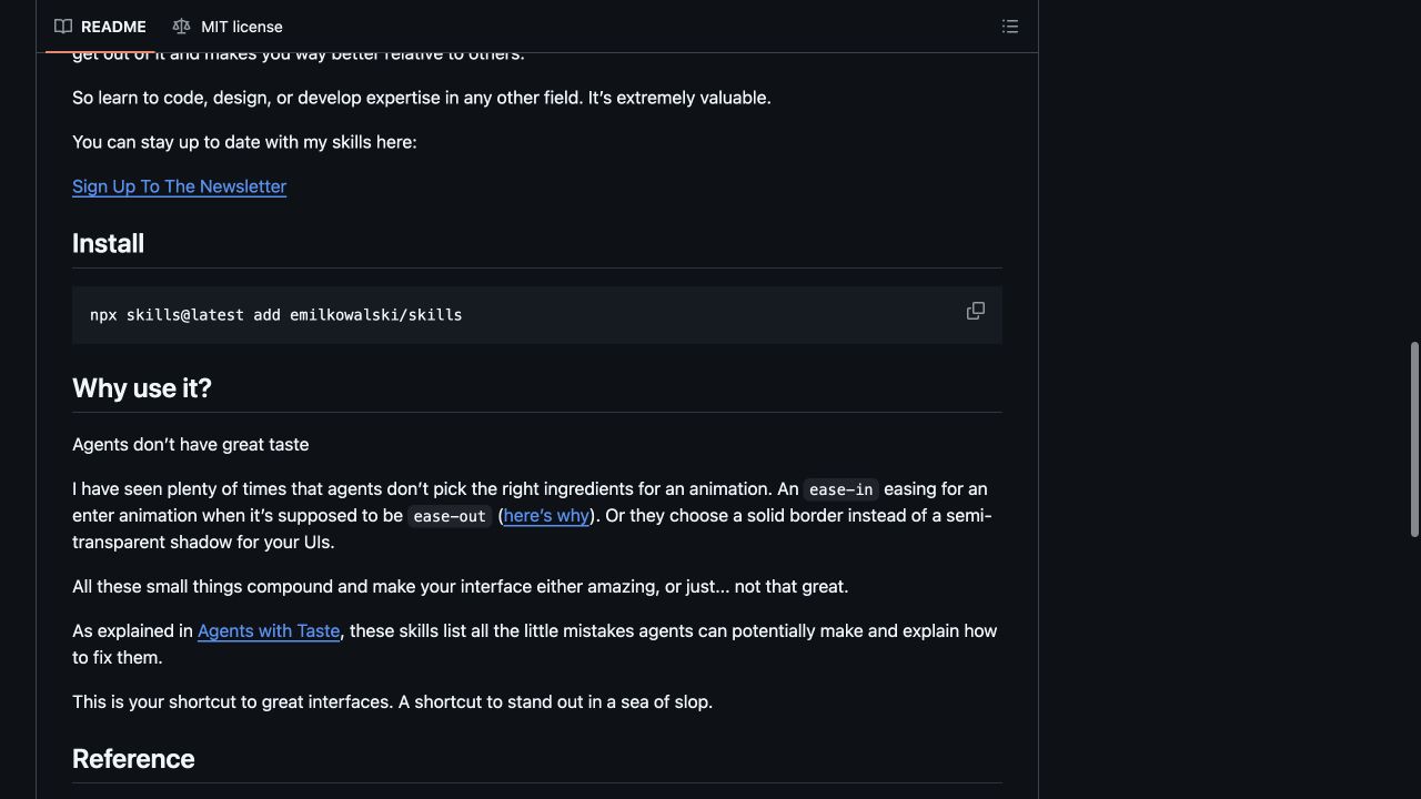
The redesign of CloudOnFire started with a useful find: Emil Kowalski’s skills repository. It collects practical instructions for building and reviewing interfaces, with particular attention to motion and the small decisions that make a page feel considered.
The attraction was straightforward. I wanted a calmer, Apple-inspired website while keeping the mix of homelab notes, gadgets, music, food and travel. A clear set of design questions was more useful than adding another collection of visual effects.
What a skill contributes
These skills are written guidance for an agent. They describe what to look for, what to avoid and how to approach particular interface problems. They are not a WordPress theme and do not automatically redesign a website.
The repository’s apple-design notes translate Apple interface principles into web practice. Other entries cover animation review, performance, prototyping and mobile behaviour. The value is in choosing the guidance relevant to the page in front of you.
What changed here
On CloudOnFire, the most visible decisions were simple: replace the neon treatment with white and soft grey, make the navigation quieter, give headlines and photographs more space, and use blue for clear actions.
The category pages also needed a structural change. Instead of displaying complete articles in a long stream, they now show photographs, short summaries and a link to the full story. That makes browsing a category feel different from reading an article, which is exactly what it should do.
Inside an article, comfortable text width and spacing matter more than decoration. The aim is to help someone keep reading after the headline has done its job.
Keep the judgement
A useful workflow is to choose one page, apply a few relevant rules, inspect the result with real content and repeat. Long titles, missing images and small screens reveal problems that an attractive empty layout will happily conceal.
The repository documents an installation command, but these design principles can also be read and applied directly. There is no reason to install every skill simply because it exists. For this redesign, the repository served as a reference; the WordPress changes still had to be implemented and checked.
That is what makes the collection worth bookmarking: it gives the work a more precise vocabulary, while leaving the final decisions with the person building the site.
References: repository and current skill list · MIT licence.
Screenshot of github.com/emilkowalski/skills, captured on 17 October 2026. Repository by Emil Kowalski; see its MIT licence.
Leave a Reply