A touchscreen can become anything, which is precisely its problem. The same glass rectangle controls volume, temperature, navigation and settings, but it never tells your hand what it is before it lights up. Physical controls do. Shape, resistance and position turn interaction into memory.
Eyes belong elsewhere
A volume knob can be found and adjusted without interrupting a conversation. A tactile camera dial communicates its position before the shutter is pressed. Controls used while driving, cooking or listening should not demand visual confirmation for every small change.
Resistance communicates
The weight of a switch, the detents of a dial and the travel of a key all provide information. Good resistance prevents accidental input and makes an action feel deliberate. This is not nostalgia; it is a compact feedback system that requires no animation or notification sound.
Dedicated means dependable
A physical control usually does one thing, immediately. Software controls can move after an update, disappear behind a modal or become unavailable when the interface freezes. Dedicated controls are valuable for frequent actions because their location and purpose remain stable.
Hybrid is the answer
Not every function deserves its own button. Deep settings and infrequent options fit naturally on screens. The strongest products combine adaptable software with tactile controls for the actions people perform constantly: power, volume, playback, temperature and capture.
Design for the hand
Controls should be distinguishable by shape and spacing, not merely labels. Important actions need room around them. Similar buttons performing opposite functions should not be identical when they can be used without looking.
The future does not need to abandon screens. It needs to remember that people have hands—and that a satisfying click can be more informative than an entire interface.
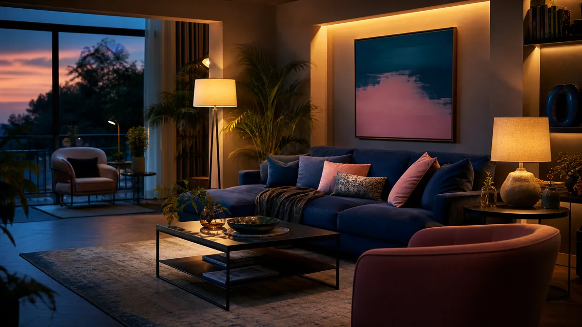
The ceiling light is efficient in the same way a supermarket is efficient: everything is visible, but almost nothing looks flattering. Homes need more than maximum illumination. They need pockets of light that support reading, cooking, conversation and the highly technical activity of doing absolutely nothing.
Think in layers
Ambient light establishes the room’s general brightness. Task light helps with a specific activity. Accent light gives depth to walls, objects and corners. A comfortable room usually combines all three at lower intensity instead of asking one fixture to perform every job.
Light the edges
Dark corners make a room feel smaller, while gently illuminated walls create depth. A floor lamp aimed toward a wall, a small lamp on a low cabinet or a shaded light near a corner can change the perceived size of the room without increasing overall brightness dramatically.
Put light where life happens
A reading chair needs a controllable lamp near shoulder height. A dining table benefits from a focused pendant that leaves the surrounding room softer. Kitchen worktops need direct, shadow-free light. Start with activities and positions before choosing fixtures.
Control glare
An exposed bright bulb at eye level is tiring even when the room looks atmospheric in photographs. Shades, diffusers and reflected light soften contrast. Sit in the places you actually use and check whether the source is visible. Good lighting should reveal the room, not interrogate its occupants.
Choose warmth intentionally
Warm light generally suits living areas, while neutral light can help in workspaces. Consistency within a sightline matters: wildly different color temperatures make adjoining areas feel accidental. Dimming is often more valuable than chasing a single perfect specification.
Keep the big light for finding a lost earring. For living, build a small constellation instead.
Minimalism is often mistaken for a restricted palette of white, grey and apologetic beige. But the real strength of a minimal room is editing: fewer objects, clearer relationships and enough space for each choice to matter. That makes color more powerful, not less.
Color creates hierarchy
In a quiet room, one saturated chair or cabinet immediately establishes a focal point. The eye understands where to land, and the surrounding furniture can become simpler. Without that anchor, a restrained interior sometimes compensates with too many small decorative objects.
Choose a useful protagonist
The colorful object should earn its floor space. A chair, lamp, rug or storage unit works better than an ornament because it combines visual impact with daily use. The goal is not to place a random bright object in the corner. It is to choose something whose form deserves attention.
Repeat, but barely
A dominant color feels more intentional when it appears once or twice elsewhere at a much smaller scale: a book spine, a line in an artwork or a ceramic detail. Exact matching is unnecessary. Related tones create rhythm without turning the room into a themed display.
Let materials calm it down
Wood, brushed metal, wool and natural stone give saturated colors something grounded to push against. Texture also keeps neutral areas from feeling empty. A bright lacquered cabinet beside warm timber feels richer than the same cabinet surrounded entirely by glossy white surfaces.
Live with samples
Color changes dramatically across daylight, evening lamps and screen photographs. Test a large sample in the actual room and observe it for several days. The exciting yellow in a showroom may become acidic under a cool lamp; a deep burgundy may become the warmest element in the house.
A minimal interior does not need less personality. It needs fewer, stronger decisions. Sometimes one gloriously colorful piece is the most minimal choice available.
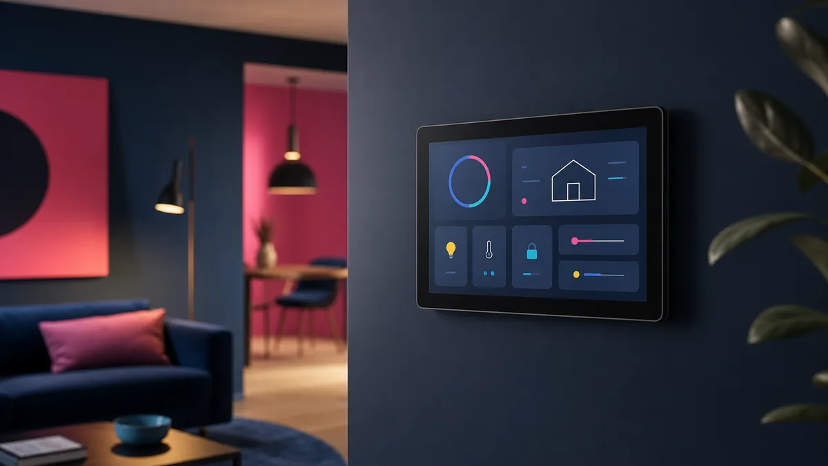
Home dashboards have a habit of becoming museums of available data. CPU graphs, weather tiles, battery percentages and twelve tiny icons compete for attention, while the one useful answer—whether the back door is locked—requires scrolling. A good dashboard is not a control panel for everything. It is a shortcut to the next sensible action.
Design around moments
Think about when the screen is used. The morning view might show weather, travel time and the state of important doors. An evening view can prioritize lights, heating and media. A maintenance view may expose server health and low batteries. One permanent wall of widgets rarely serves all three moments well.
Show exceptions first
Normal systems do not need attention. Replace a sea of green indicators with a quiet status summary and reveal detail only when something is wrong. A single “everything is okay” message is calmer and more informative than twenty green circles.
Keep controls forgiving
Large targets, clear labels and immediate feedback matter more than visual cleverness. Avoid controls whose effect is ambiguous. If a button starts a scene, show what changed. If an action is risky, separate it from everyday controls and require confirmation.
Respect the household
A dashboard should make sense to someone who did not build it. Use ordinary language rather than entity IDs and technical abbreviations. Ask other people which tasks they actually want on the screen. Their answer may be “none,” which is also useful design feedback.
Delete relentlessly
If a card has not influenced a decision in a month, remove it. The underlying metric can remain available in a diagnostic tool. The shared dashboard should stay focused on information that changes what someone does next.
The best home dashboard feels less like mission control and more like a good light switch: obvious, dependable and almost invisible.
Backup dashboards are excellent at producing green check marks. Unfortunately, a green check mark usually proves only that a job ran. It does not prove that the right files were captured, the archive can be opened or the recovery instructions make sense when the original system is gone.
Start with consequences
Classify data by what its loss would mean. Family photos and original work may be irreplaceable. Application containers can often be recreated, but their databases and configuration cannot. Downloaded media may be large yet replaceable. This distinction determines how many copies you need and how quickly each one must return.
Use independent copies
A useful baseline is multiple copies on different storage, with at least one outside the home. Independence matters. A second folder on the same machine is not protection from disk failure, malware or accidental deletion. An attached backup drive may disappear in the same electrical event as the server it protects.
Protect the instructions
Recovery documentation belongs outside the system being recovered. Record where backups live, how they are encrypted, which credentials are required and the order in which services should return. Include enough detail for a tired future version of yourself who no longer remembers the clever shortcut used two years ago.
Restore small things often
Choose a file every month and recover it to a temporary location. Periodically restore an application into an isolated environment and verify that it starts. These tests expose missing volumes, incomplete database dumps and forgotten encryption keys while the original system still exists.
Measure recovery, not storage
A tiny configuration file may matter more than a terabyte of replaceable media. Track the time needed to restore important services, not merely the capacity consumed by backups. Recovery time is the number that matters during an incident.
Backups should be boring. Restore day should be boring too. That only happens when recovery is practiced before it becomes urgent.
Self-hosting begins with possibility. One service becomes five, a dashboard becomes a second dashboard, and suddenly a quiet Sunday involves reading release notes for software that was supposed to simplify life. The honeymoon phase is fun. The useful phase begins when each service has to justify its maintenance.
The test: would you miss it?
A service earns its place when its disappearance causes a real inconvenience. Local DNS, password management, document storage, backups and home automation usually pass this test. A novelty dashboard displaying information already available elsewhere often does not. Stop judging the lab by container count; judge it by problems removed.
Keep identity boring
Central authentication is valuable, but it also creates a critical dependency. Use a setup you understand, maintain recovery credentials and document how to regain access when the identity provider is unavailable. Clever login flows are less impressive at midnight when every service redirects to an error page.
Own the data that matters
Photos, documents, notes and configuration deserve local control and multiple backups. That does not mean the internet must be banished. Off-site encrypted storage can complement local copies. The point is to avoid having a single company, disk or password become the only route to irreplaceable data.
Prefer boring software
Mature projects with clear documentation, predictable upgrades and portable data tend to survive enthusiasm cycles. A beautiful interface is welcome, but an export button is more important. Choose tools that let you leave without reconstructing years of information by hand.
Delete with confidence
Retiring a service is not failure. Export its data, archive its configuration and remove it. Fewer moving pieces mean clearer alerts, faster upgrades and more time for the systems that genuinely help.
A sustainable homelab is not the one with the most logos on its start page. It is the one that still feels worth maintaining after the novelty disappears.
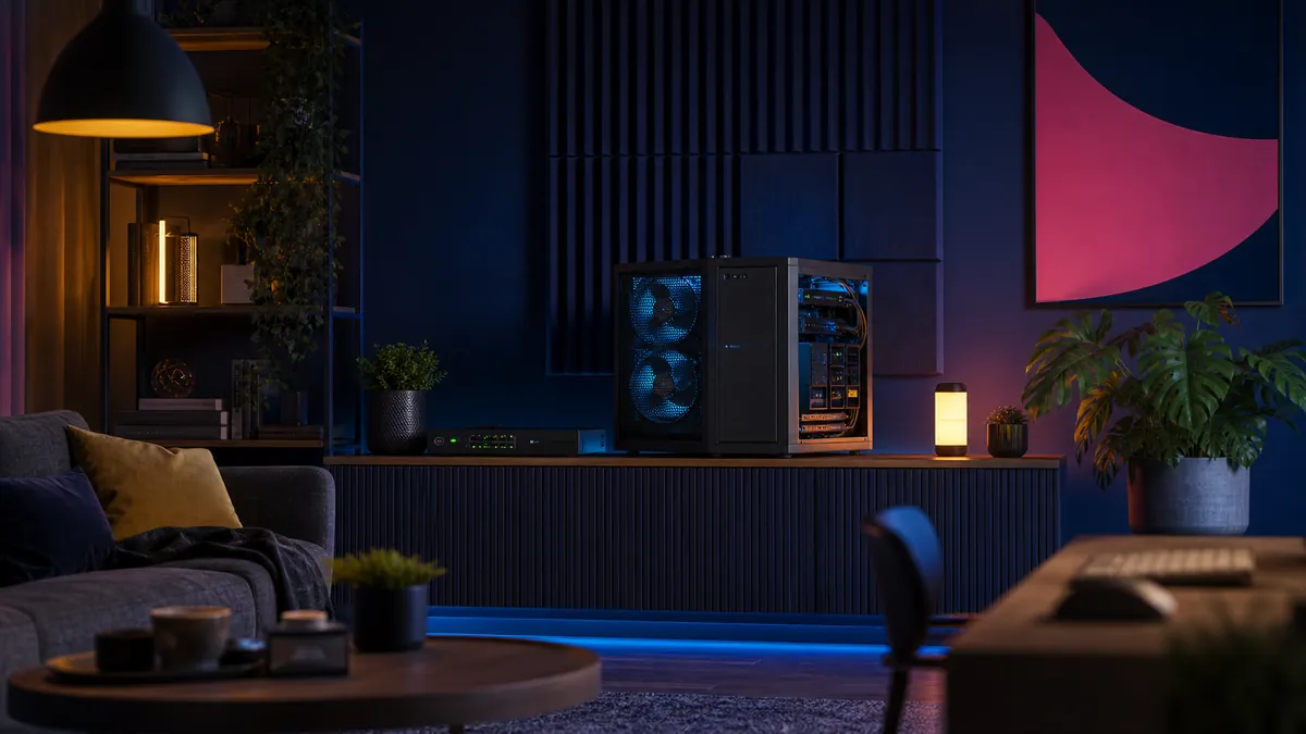
A homelab can be technically brilliant and still be a terrible housemate. The familiar recipe—retired enterprise hardware, too many tiny fans and a rack placed wherever it fits—often creates a machine room in a place that was supposed to feel like home. The better goal is not silence at any cost. It is useful performance without a permanent jet-engine soundtrack.
Begin with the work, not the rack
Before buying quieter fans, list what the lab actually does. A few containers, Home Assistant, DNS, backups and a media server rarely need a dual-socket enterprise machine idling all day. Measure CPU use, memory pressure, storage activity and peak demand for a week. Downsizing an underused host can remove more heat and noise than any acoustic treatment.
Large fans win
Small fans have to spin quickly to move air. Larger fans can move the same volume more slowly and with a less irritating sound profile. Use unobstructed airflow, clean filters and sensible fan curves. Avoid forcing air through an unnecessary maze of drive cages and cables. A simple front-to-back path usually works better than a collection of heroic high-speed fans.
Storage changes the character
Hard drives produce more than airborne noise. Their vibration travels through shelves, floors and furniture. Rubber isolation helps, but placement matters more. Keep spinning disks away from hollow cabinets and shared walls. SSDs are ideal for active services; larger disks can remain for backups and bulk media where their activity is less constant.
Temperature is a budget
Chasing the lowest possible temperature creates noise without necessarily improving reliability. Modern hardware is designed to operate safely across a broad range. Set realistic temperature targets, monitor them and let fans respond gradually. Sudden fan ramps are often more distracting than a steady low hum.
Design for maintenance
A quiet system becomes loud again when filters clog or a fan starts failing. Leave enough space to clean it, label airflow direction and log temperatures. Keep one known-good replacement fan on hand. Quietness is not a one-time modification; it is part of operating the lab.
The nicest homelab is the one you can forget is running. It should make the house smarter, safer and more useful—without constantly announcing its presence.
CloudOnFire runs from a residential internet connection with an address that can change. The trick is not pretending that a home connection behaves like a data centre. It is designing the public edge, DNS updates and origin server so that a routine address change becomes boring—and so that publishing the architecture does not publish an attack map.
The pattern, deliberately abstracted: home origin, protected edge and an address that can move.
The architecture in one paragraph
A small web server lives inside an isolated virtualised environment on the home network. The domain’s authoritative DNS is managed at the cloud edge and public requests are proxied before reaching the origin. A tiny Dynamic DNS updater checks the residential public address and changes one designated DNS record only when necessary.
That is the complete public description. Internal addresses, container identifiers, usernames, management paths and exact firewall configuration remain private because none of them would make this article more useful.
Dynamic DNS should have one small job
The updater needs permission to modify the relevant DNS record—not the entire account. The credential should be scoped to one zone and the minimum required DNS-edit capability. It belongs in protected configuration, never in a script pasted into a post, a screenshot, a shell-history tutorial or a public repository.
The update interval does not need to be frantic. The client can compare the current public address with the existing DNS value, update only after a genuine change and log success without printing secrets.
The safest automation is boring, narrowly authorised and almost invisible.
The proxy is helpful, not magical
Proxying through Cloudflare keeps normal visitors away from a direct origin connection and provides TLS termination, caching and traffic filtering. It does not automatically secure the machine behind it. If the origin still accepts arbitrary traffic from the entire internet, discovering the residential address can allow someone to bypass many edge protections.
A stronger design limits web traffic at the origin to trusted proxy networks where practical, keeps the firewall explicit and exposes only what the public site actually needs. The hypervisor, database, SSH and container-management interfaces never belong on the public web.
TLS all the way to the origin
The browser-to-edge connection is only half of the journey. The edge-to-origin connection should also use valid TLS with strict certificate validation. “Flexible” encryption may look convenient, but it leaves the final leg unencrypted and can create confusing redirects. Full strict validation is the goal.
WordPress is part of the security boundary
The network can be beautifully designed and still be undermined by an abandoned plugin or weak administrator account. Themes and plugins stay updated, unused components are removed or disabled, administrator accounts are kept to a minimum and authentication is protected with MFA or a strong identity provider.
The database is reachable only from the application environment. Backups are stored separately and restoration is tested rather than assumed. A backup that has never been restored is merely a theory.
What I deliberately do not publish
The current or historical public IP address
Internal subnets, hostnames or container IDs
Router, hypervisor or operating-system fingerprints
Exact port-forwarding and management rules
API tokens, client secrets or screenshots containing them
The location of administration interfaces
Backup destinations and recovery credentials
The lessons worth sharing
Use narrowly scoped credentials. Separate public services from management. Encrypt both sides of the proxy. Assume addresses change. Keep the origin patched. Test recovery. Document the principles publicly and the implementation details privately.
A changing home IP is not the interesting problem. The interesting problem is building a system in which change does not tempt you to weaken everything else.
This article intentionally describes a general security pattern, not a reproducible map of the live CloudOnFire network. Configuration should be adapted to your own threat model and verified against current vendor documentation.
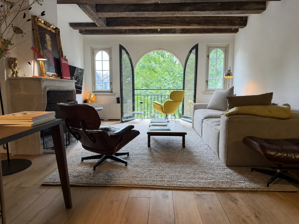
The yellow chair by the open window looks cheerful. Underneath, it is doing serious engineering. Vitra’s Grand Repos, designed by Antonio Citterio in 2011, is a contemporary wing chair built around movement: it supports the body from upright conversation to fully reclined retreat without advertising the mechanism that makes it possible.
Grand Repos in yellow: part shelter, part machine, and impossible to ignore.
A wing chair without nostalgia
The high back and projecting head section connect Grand Repos to the traditional wing chair, but Citterio removes the historical decoration. The volumes are broad and protective; the seams give the upholstery just enough structure; the swivel base keeps the object visually lighter than its comfort suggests.
The result feels architectural. It creates a room within the room, especially when placed near a window or away from a wall. From behind, the chair reads as a single strong silhouette. From the seat, the wings reduce peripheral distraction and make reading or listening feel private.
The hidden mechanism
Vitra describes a synchronised mechanism concealed beneath the upholstery. Backrest and seat respond together as the sitter changes position, and the chair can be locked at different reclining angles. Resistance can be adjusted to suit the user’s weight.
This is the opposite philosophy from a visibly mechanical office chair. Grand Repos hides the technology so that comfort feels intuitive. The lever is present, but the chair never looks like equipment.
Why yellow changes everything
In a neutral fabric, Grand Repos can behave as quiet background architecture. Yellow turns its protective form into something optimistic. Against green trees outside the window, the chair becomes almost graphic—a warm shape floating between the pale room and the view.
It also prevents the interior’s celebrated classics from becoming too reverent. A burgundy Eames Lounge Chair is dark, grounded and materially rich. Grand Repos is bright, upright and visually buoyant. Their disagreement is what makes the pairing work.
A room becomes personal when excellent objects are allowed to argue with one another.
Contemporary comfort among older icons
Grand Repos is decades younger than the Eames Lounge Chair and Cees Braakman’s Pastoe seating. It does not need to imitate either. Instead, it demonstrates how the lounge-chair problem evolved: the fixed geometry of mid-century design gives way to adjustable support, removable upholstery and a mechanism engineered around different bodies and postures.
The chair earns its place not because it is collectible, but because it is used. It faces the view, catches the changing daylight and offers the most naturally private seat in an otherwise open room.
A burgundy Eames Lounge Chair does not disappear into a room—and it should not. The deep leather, curved wooden shells and black aluminium base create a silhouette that is generous without becoming bulky. It is an icon, certainly, but the real pleasure begins when it stops behaving like museum furniture and becomes part of everyday life.
Burgundy leather, dark shells and a room that happily mixes design generations. Editorial image based on the actual interior.
The chair that changed the idea of modern comfort
Charles and Ray Eames introduced the Lounge Chair and Ottoman in 1956. Instead of the visual austerity associated with much early modern furniture, it offered softness, warmth and the relaxed character of a well-used club chair—reinterpreted through moulded plywood and industrial production.
Vitra has produced the chair in Europe since the 1950s using methods that remain close to the original. The relationship between the three curved shells and loose cushions is the essential idea: structure and softness remain visibly separate, which keeps the chair from looking heavy.
Why burgundy is better than safe black
Black leather is canonical. Burgundy is personal. It brings out the reddish warmth in the wood veneer and changes throughout the day, moving from near-brown in shadow to wine-red in direct light. Marks and creases become part of that colour rather than flaws to be corrected.
The chair works especially well among old beams, stone, books and imperfect materials. Its precision gives the room structure; the leather prevents that precision from feeling cold.
The best original design is not protected from life. It becomes better evidence of it.
Across the room: Grand Repos in yellow
The yellow chair in the background is not another Eames. It is Vitra’s Grand Repos, designed by Antonio Citterio in 2011. Its concealed synchronised mechanism allows the backrest to recline and lock at different angles. Where the Eames Lounge Chair makes its construction visible, Grand Repos hides the engineering inside generous upholstery.
The combination is more interesting than a matching pair. Burgundy and yellow create tension; American mid-century optimism meets contemporary Italian precision; one chair cradles through fixed geometry while the other moves with the sitter.
The quieter counterpoint: Cees Braakman’s SM07
Elsewhere in the interior, the black dining chairs appear to be the SM07 designed by Dutch modernist Cees Braakman for UMS Pastoe’s Japanese Series around the turn of the 1960s. Their slender chromed-steel frames and black upholstery use almost nothing to describe a chair.
The likely Pastoe SM07: visually light, geometrically direct and unmistakably Dutch. Reference image; labels and construction should be checked for definitive authentication.
Braakman’s restraint is the necessary counterweight to the lounge chairs. The SM07 does not compete for attention. Its thin rectangular frame allows architecture and people to remain visible through it. That visual economy is why a sixty-year-old dining chair can still feel current.
An interior built through contrast
Good rooms rarely come from buying a complete collection at once. They grow through differences: sculptural lighting against old stone, a technically complex recliner beside a 1950s icon, and minimal Dutch dining chairs holding the composition together.
The Eames remains the emotional centre—not because it is famous, but because burgundy leather gives a highly recognisable object a specific life and place.